Need to bring more patrons through your door tonight?
Try Mixie!
The Problem
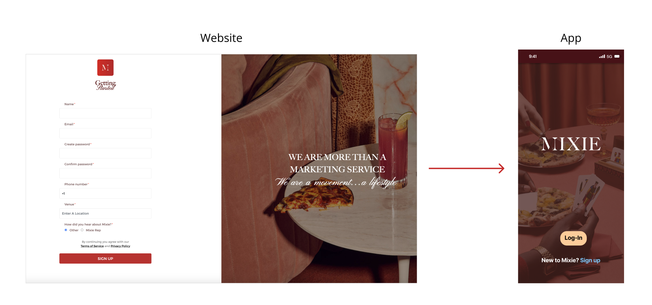
The team was tasked with designing a scalable onboarding process for venue partners of our client, Mixie. To give context, currently, the process begins with venue partners applying on Mixie’s website, and then Mixie sets up the venue’s profile and featured offers themselves.
The Solution
The result of our design process was a fully transferred onboarding process from mixed media to the mobile app that provided a streamlined and easy way for venue partners to take control of their own profile set up.
Timeframe:
Tools:
My Roles:
2.5 weeks in November - December 2022; Client Project
Project Manager
UX Designer
Figma, FigJam, Notion, Maze, Otter, and Google Suite
Team:
Dim, Elinor, Hannah, Jenna, and Sam
Project Overview

The Design Process
Empathize: Research to Empathize
In order for us to address this business need, we wanted to first understand the people who would be using this app.
Mixie’s target venue partner is owner operated restaurants and venues, so we reached out to owners of restaurants to get their insights on their day-to-day workload and existing marketing practices.
We conducted these 7 user interviews, with the following goals in mind:
Find out what venues are doing now to advertise/get patrons in their doors
Understand if restaurant/bar owners are interested in a digitized way to get that first customer
Understand what they are willing to give in exchange for social media exposure and new patrons
Find out what business metrics venues want access to
Define: Synthesized Data
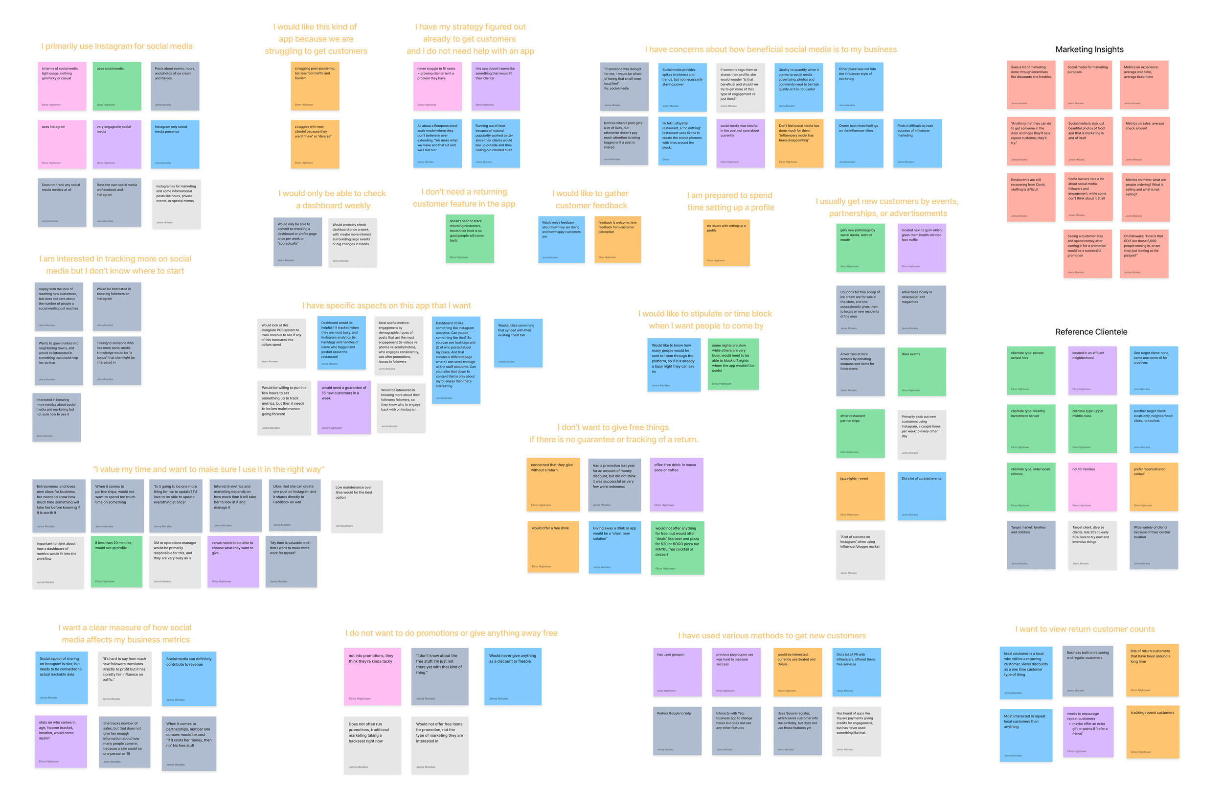
Affinity Map:
We created an affinity map and some of our key takeaways included:
Restaurant owners are juggling so much already, that they need very straightforward and profitable solutions.
Many of them are willing to spend some time setting up a profile, but they would need it to be easily maintained.
Social media is a great tool, but many owners expressed that they would need a way to clearly track whether these posts were resulting in actual revenue.
Problem Statement:
This led us to our problem statement, which guided our design process of the onboarding flow.
Owner-operated venues need a flexible way to fill their seats at hours of their choosing with offers of their choosing so that they can increase their bottom-line.
How Might We:
We also brainstormed some “how might we” statement, the following standing out to use the most
How might we design a flexible venue onboarding experience that also utilizes information that’s already available?
Taking Inspiration from Airbnb: Comparative Analysis
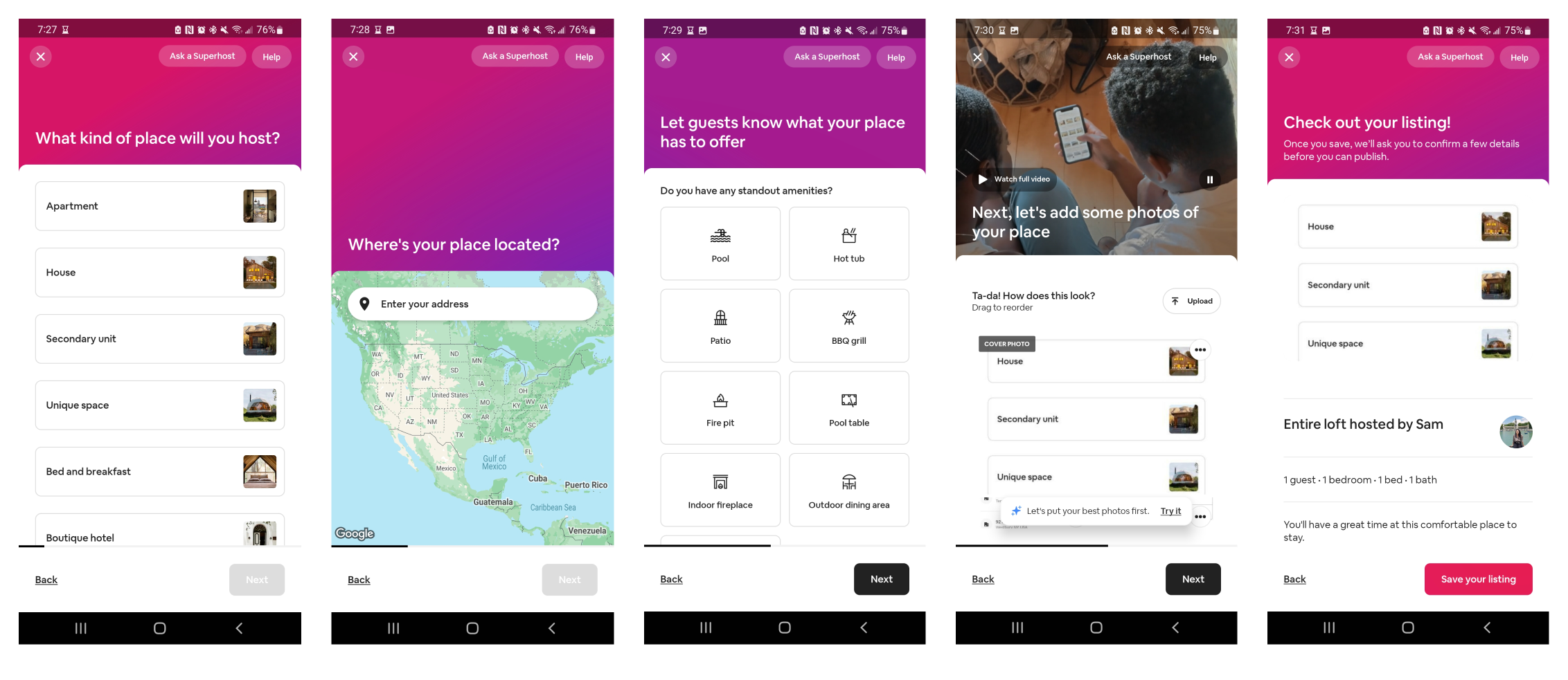
While we looked at a number of competitors, we derived our inspiration for an onboarding flow with a comparative analysis of successful dual-sided platforms like Uber and Airbnb.
Some of our key takeaways were that clean screens with digestible amounts of information are important.
For Airbnb specifically, they have a very logical flow of starting big picture with location, and ending with smaller details like amenities offered.
Airbnb also has a nice review screen before saving the listing, we wanted to be sure that Mixie’s users felt confident in the information they would be sharing with potential customers.
Persona:
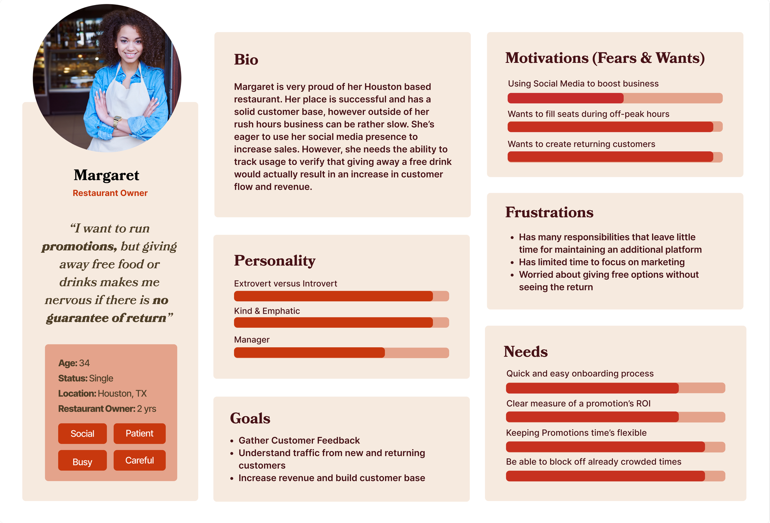
With these things in mind, we created our persona, Margaret, a restaurant owner in Houston, TX
She has a lot of responsibilities, so she needs anything she uses to be quick and easy.
Margaret would be interested in anything that introduces her brand to new customers, but she needs to keep promotion times flexible, as she has times of the week that her restaurant is already at capacity.
She wants to take advantage of social media marketing, but she needs to be sure she can see the return on the investment of a promotion.
Ideate: Design Studio & Initial Idea
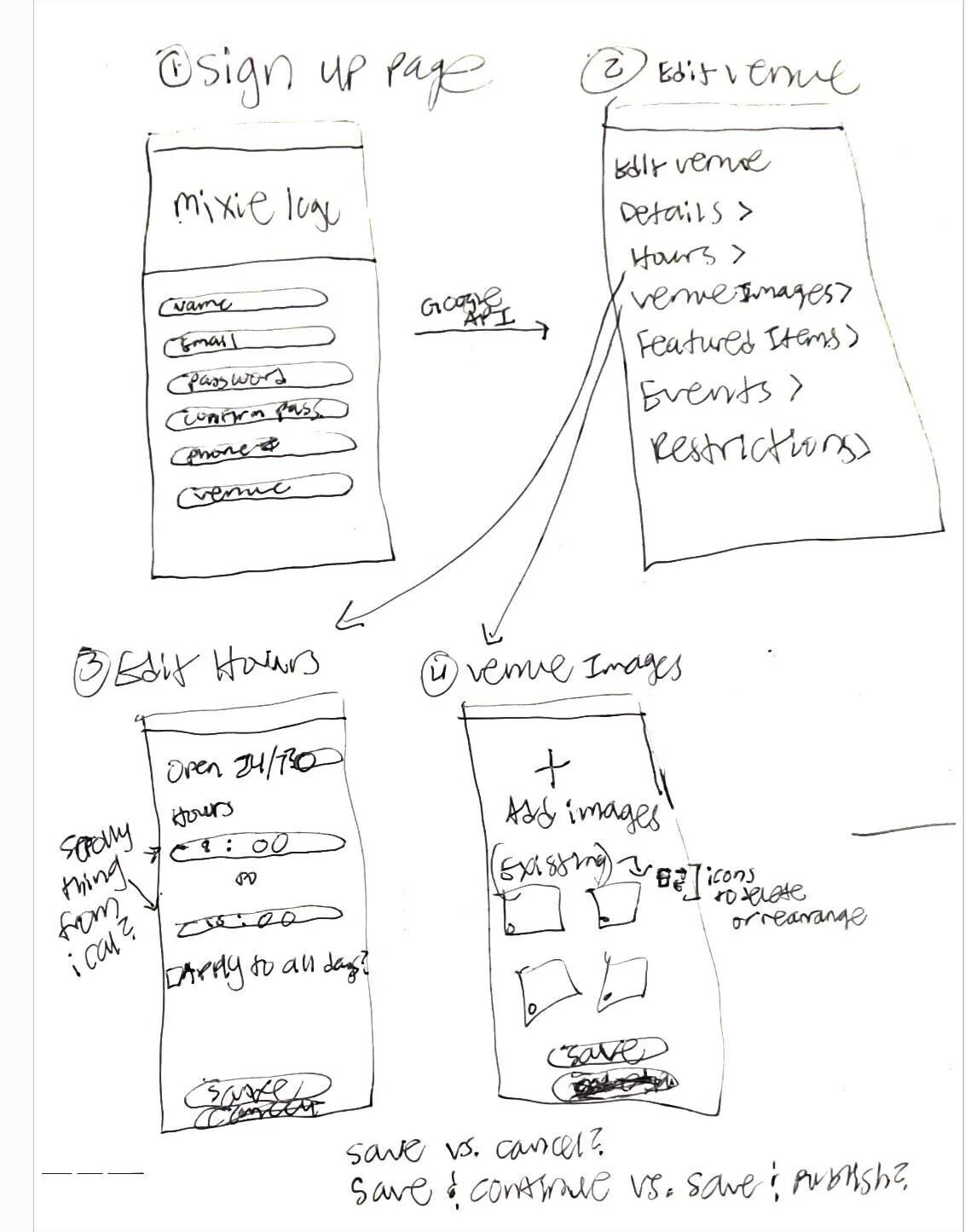
At this stage we decided to do a “design studio” to get our ideas together and align the team.
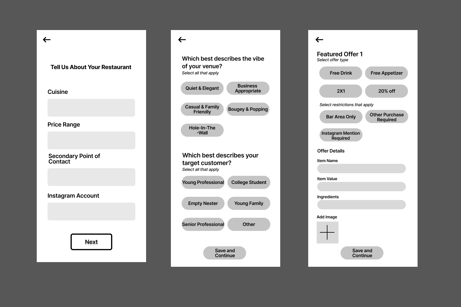
From these sketches we developed our initial onboarding wire flow, and focused on three things:
The Account Setup
The Profile Setup
And creating an offer or what we called a “the featured offer”
(The featured offer would be a free drink, or appetizer or whatever the restaurant owner wanted to exchange for exposure).
The screens reflect the research results and were less about clicking, and more about implementing the feedback.
Concept Testing
From the concept test, we found that those surveyed said “YES” that the “setting up a profile”, and the “featured offer” could appear together.
Plus, they gave us other tips like:
consider Tik Tok, as well as Instagram
look at ways to explain what “featured offer” meant
give the user a place to add extra comments, just on the off chance they wanted to give extra info, that didn’t fit anywhere else.
All of this created a clear direction for us to go in.
Prototype Pt.1: Iterate
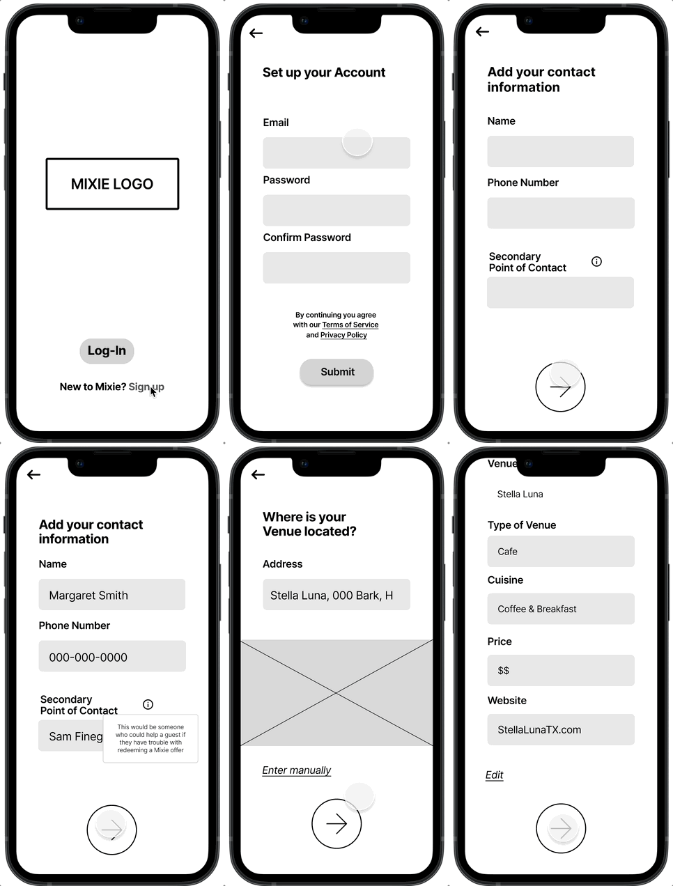
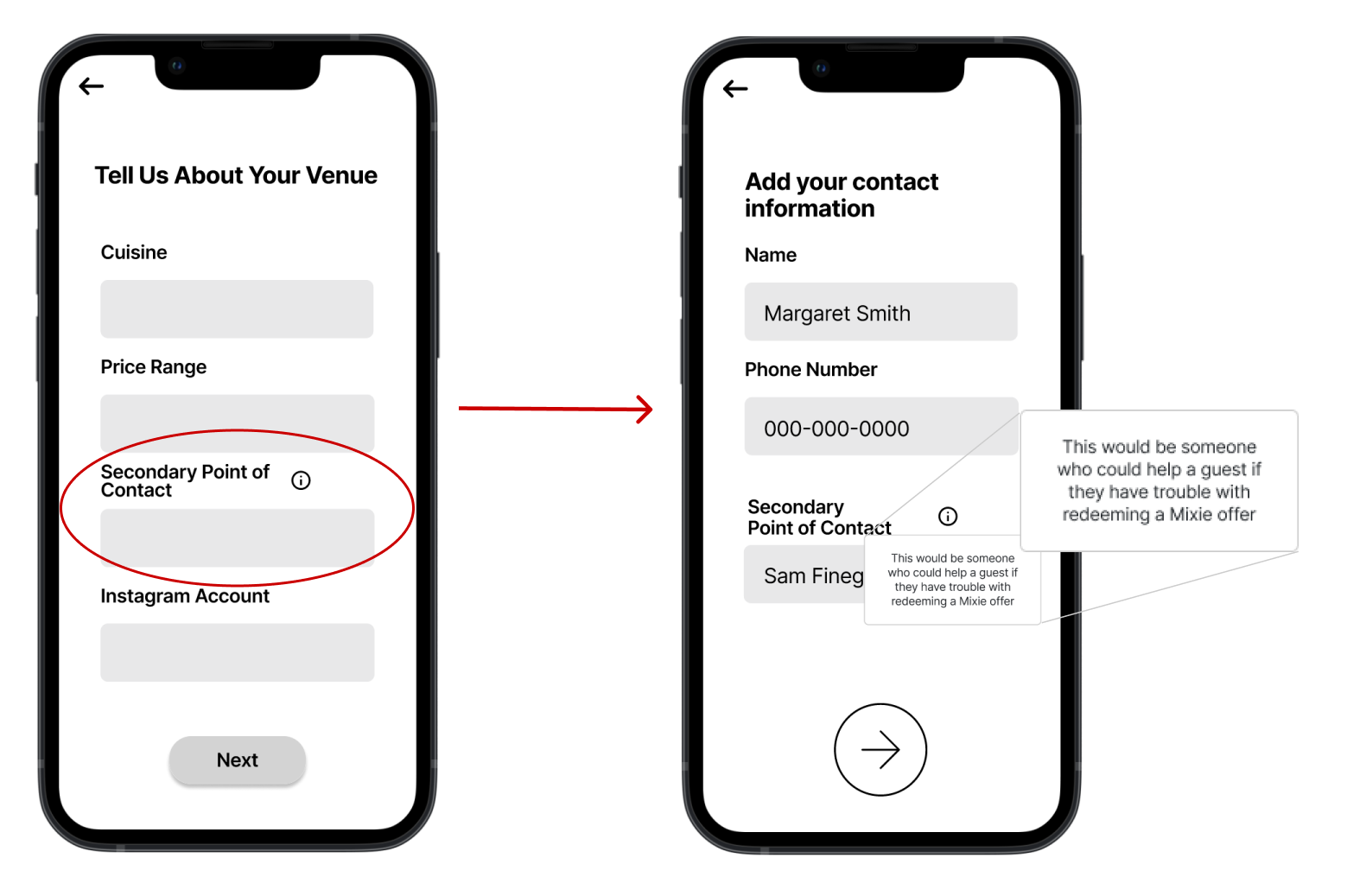
To address the confusion around “What is a 2nd Point of Contact?” from concept testing, we decided to move the field from the “Tell us about your restaurant” screen to an earlier contact information screen to keep similar items together.
On top of that, we created an information overlay that would explain the term when the user clicks on the “information” button next to it.
Additionally, if you take a look at the bottom of the screen, we implemented feedback that buttons with arrow icons should be used over words like “next” to move forward, which also happened to align well with the existing app design.
Lengthy but Necessary
We then conducted an unmonitored usability test with 10 participants, and found that:
A usability score of 86, confirmed the flow was usable
Average time users spent on each screen was 5.1s
Testers voiced that while the process was long, all of the information we were asking for felt necessary which gave us the validation that we were building something that was easy to use and worth the venue’s time to fill out.
Building the Mixie Universe
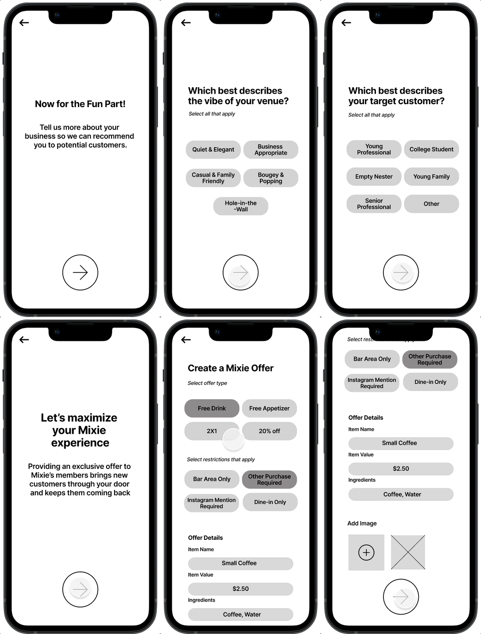
As we continued to think about feedback, we remembered that these venue owners would be using Mixie for the first time and would need to have more context on certain terms, why they're filling something out, and where they are in the profile setup process.
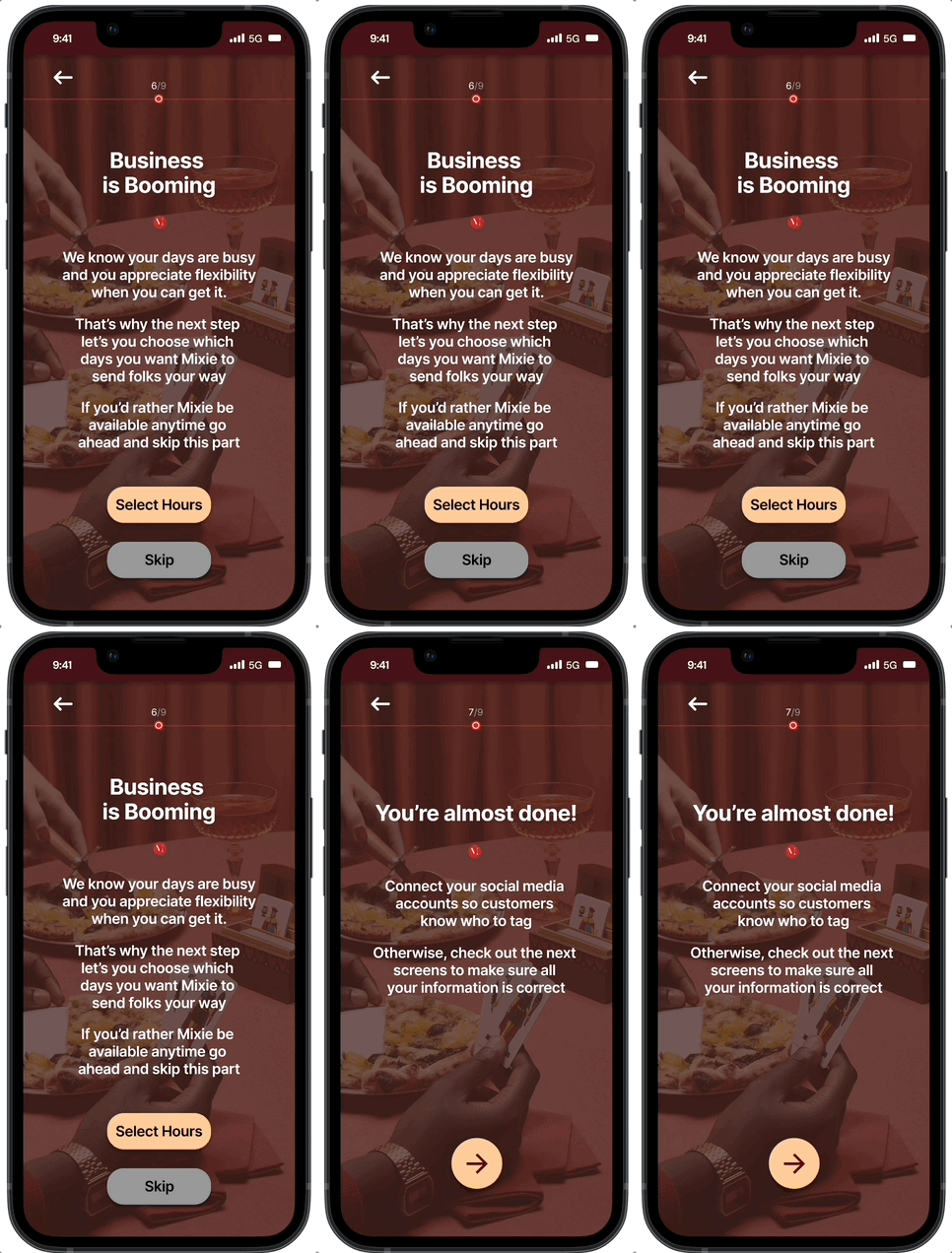
To address this, we decided to incorporate something we referred to “pre-screens”. These screens would come before the task and provide instructions or reasoning for step that they were about to enter.
Test Pt.1: Usability Testing
Prototype Pt. 2: Iterate & Usability Testing (Again)
To see how folks reacted to the longer flow in real-time and get more in-depth responses, we conducted a monitored usability test.
We had 5 participants click through the app and share their thoughts as they interacted with it. To our surprise, participants confirmed the pre-screens were helpful in providing the reason “Why” they were doing something.
Almost There!
As we worked to bring the app and all of our learnings together, we chose to continue making updates in a mid-fi design to focus on the content and get it right before upping the fidelity.
We added on other important features such as a
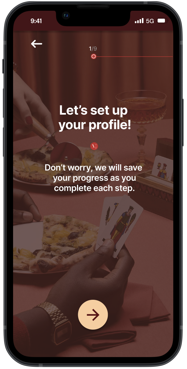
Progress tracker at the top of the pre-screens
Written assurance that their progress would be auto-saved as they completed steps,
And implemented the flexibility to review their information and edit sections before fully saving their profile updates.
Skip!
Last but not least! The feature everyone was looking for: the elusive skip button!
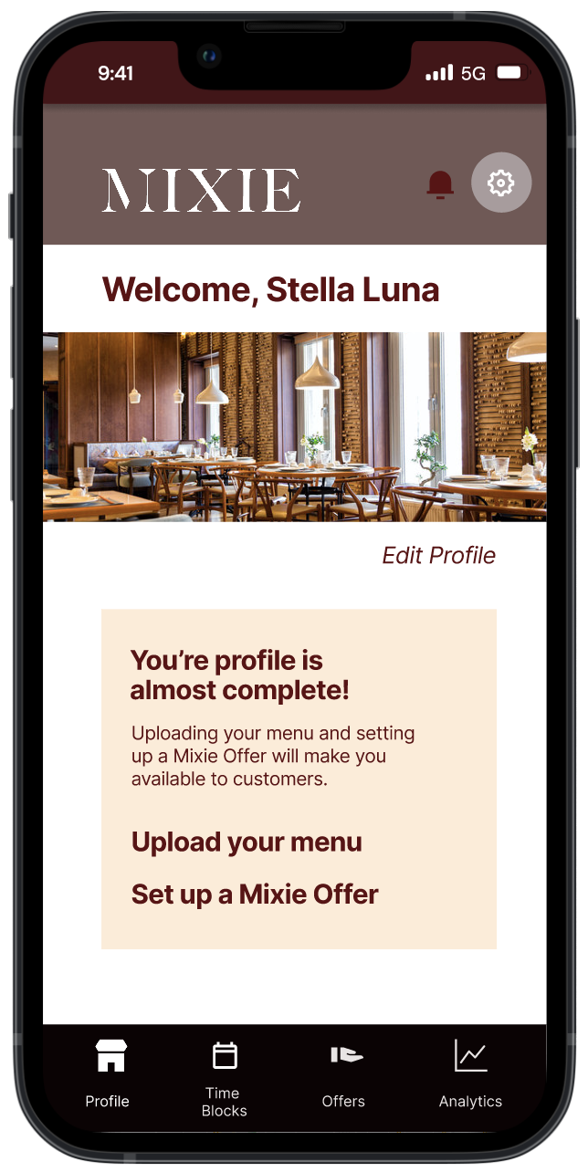
While we created this button, we were also aware of the Mixie ecosystem's need for the venues to have a complete profile. We made sure to pair the update with the creation of a reminder notification that would pop-up on their home screen later to return to those specific sections they skipped.
Final Proposed Solution
Next Steps
Test again for more quantitative metrics. Being able to test the high-fidelity prototype would provide more quantitative metrics around the app’s usability since most of our testing results were qualitative.
Doing a deep-dive on Mixie’s dashboard and metrics. As briefly touched on earlier, both our user interviews and competitive analysis supported the need for analytics and metrics to show Mixie’s ROI to the venues. Unfortunately, due to the time constraints for the project, we could only do some initial ideation based on the current online dashboard; however, to make sure we were delivering a holistic onboarding process, we had to narrow the scope.
Exploring the integration of social media and other POS systems venues are using. Not only would adding the option to create exposure via popular apps like TikTok, but integrating with POS systems like Toast Tab or Square could provide powerful metrics on Mixie’s ROI for the venues.
Reflection
Meet with client early and often. Not only does this allow the team to start working sooner, but also makes sure you’re heading in the right direction and keeping key stakeholders informed
If you’re stuck, go to who’s available! If your crunched for time and the client isn’t able to meet, use what other resources are available to you, like the development team, or mentors who you can get more insights from or bounce ideas off of them
Breaks are good too. As PM I could have done a better job of building in expected breaks and creating more touch points for the team to align on priorities.
