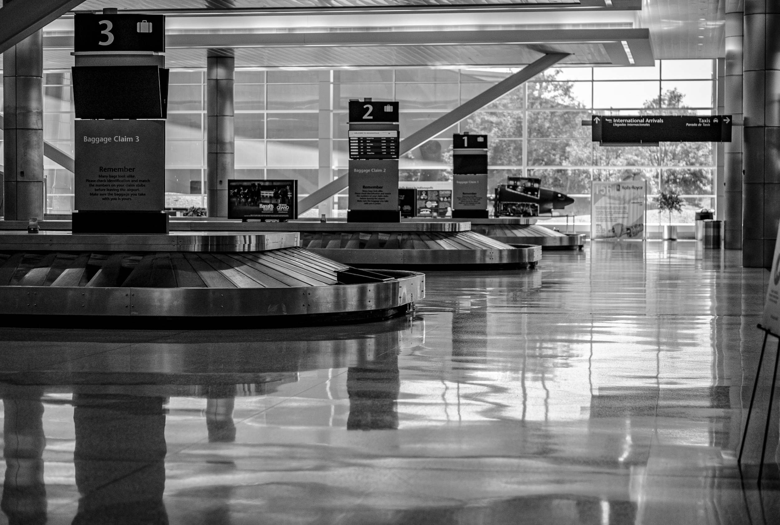
You’ve been at the baggage claim for 30 minutes now and your checked bag is nowhere to be found. All you can think is:
Where is my bag?!
Why isn’t it here with me??
Will I get my belongings back?
How can I continue to trust the airline after this has happened?
But what about my wine?!
Who has it?
The Context
The moment restrictions for Covid-19 eased in the summer of 2022, the demand for air travel surged. Unfortunately, with this increase also came increasing travel delays, canceled flights, and inevitably, thousands of cases of mishandled baggage. Travelers faced greater uncertainty around their plans and next steps.
Though Southwest Airlines was named one of the top 5 airlines least likely to mishandle baggage, they wanted to make use of the PR boost and improve the lost baggage experience for their travelers. Southwest handles one out of every 250 bags a year, and are seeking to make this experience easier for their travelers.
The Problem
Travelers with mishandled baggage needed a way to access information about their baggage on the go. With the current experience, users didn’t have a clear line of sight into the whereabouts of their baggage, and were losing trust in the airline due to the lack of reassurance of their situation.
Together, the team came up with the following problem statement:
Southwest travelers whose baggage was delayed on a trip want to know where their belongings are and when they will get them back.
The Solution
A simple, responsive web design for travelers on-the-go.
Timeframe:
Tools:
My Roles:
2 weeks in October-November 2022;
Speculative Project
Project Manager, UX Designer, UX Researcher
Figma, FigJam, Maze, Otter, Trello, and Canva
Design Team:
Carolina, Daniel, Hetal, Karielle, and Sam
Project Overview

The Design Process
Research to Empathize
Research Goals
Learn what experiences travelers have had with mishandled baggage
Find out what current state looks like for the website. How easy is it for travelers to navigate?
Understanding Our Travelers
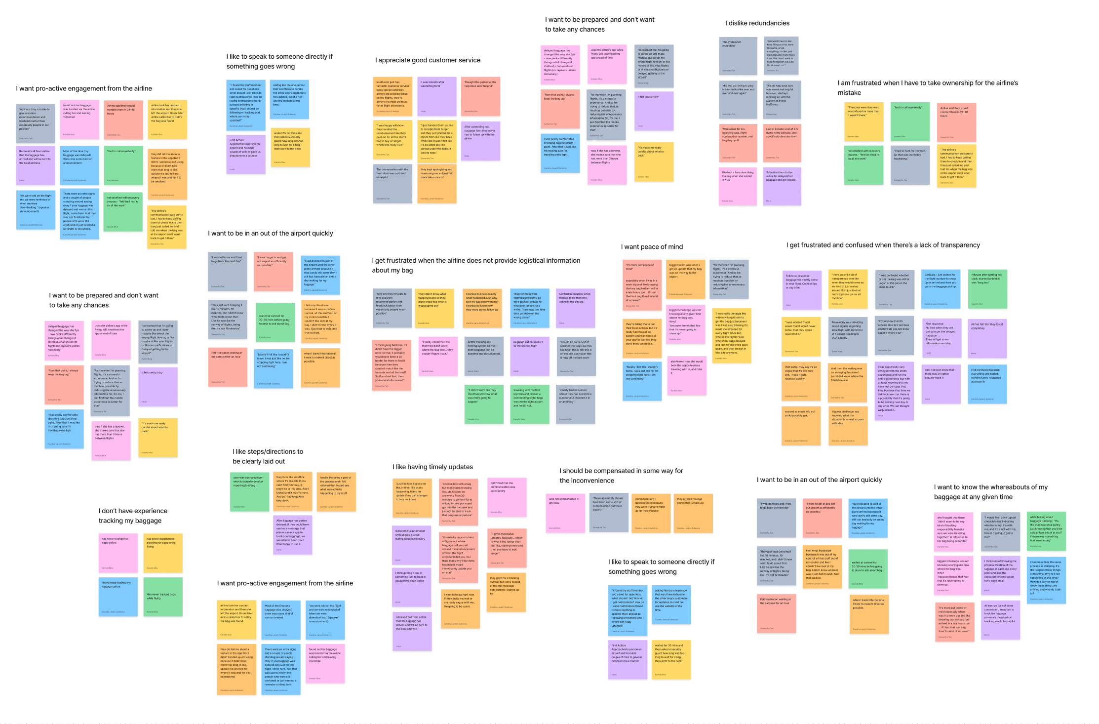
To understand the mishandled baggage experience, we interviewed 8 individuals who had their baggage mishandled within the past few years, sourcing them through our social networks.
While we were worried at first about finding participants with recent experiences, we found that despite the differences in recency, the overall experiences were almost identical.
Click Image to Enlarge
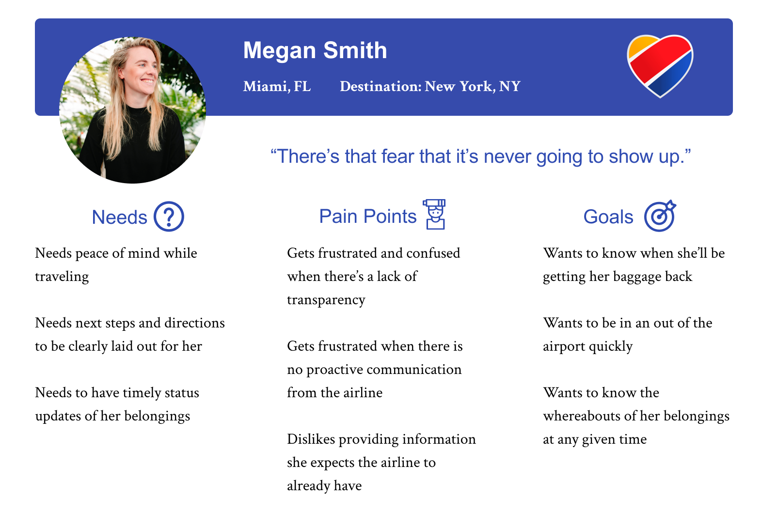
Introducing Megan, the Southwest Traveler
To help us synthesize our findings, the team constructed the Persona of Megan.
Having Megan helped us to understand the traveler’s journey holistically, and have a point of reference later in the ideation phase.
Click Image to Enlarge
Are Users Familiar with the Existing Site?
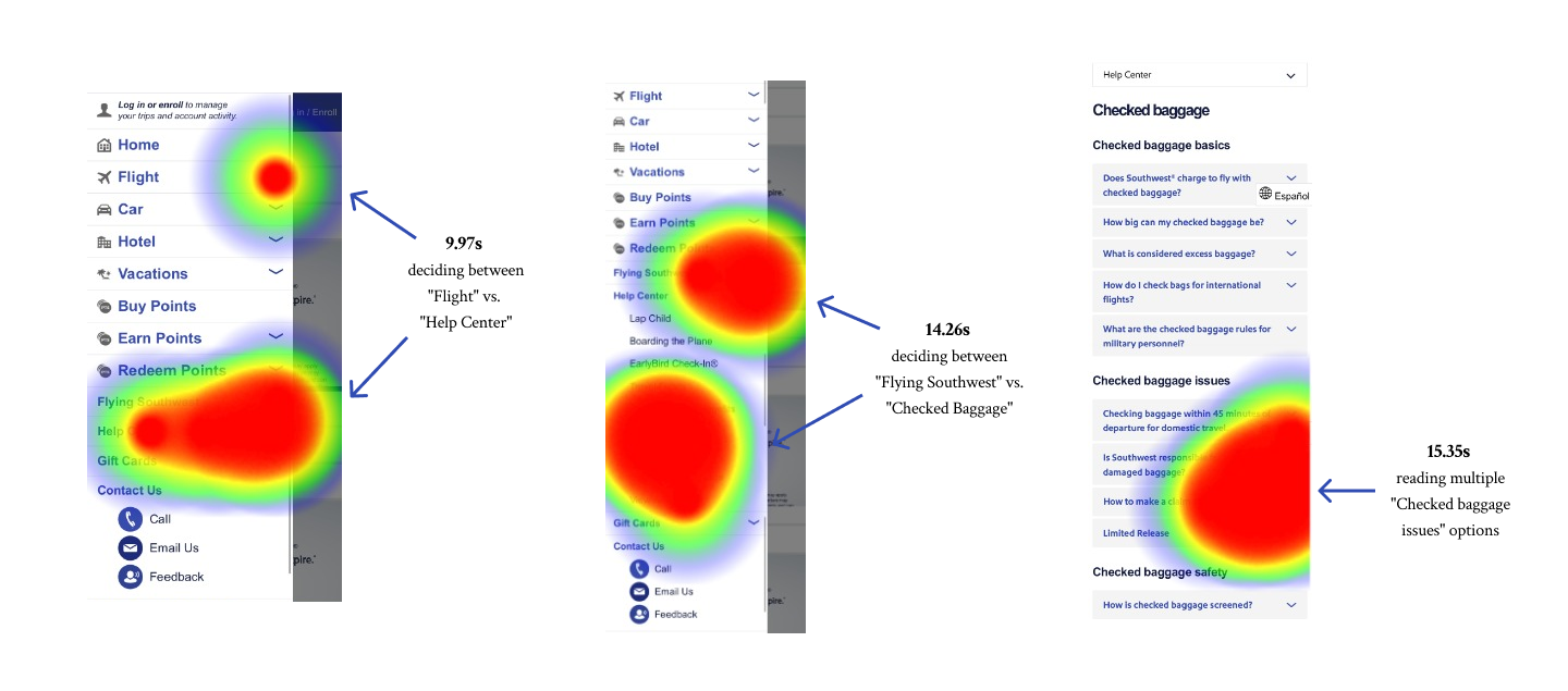
The Team conducted a content test to understand how familiar users were with the existing website. When participants were asked to make a claim for a lost check-in bag through the existing website, we noticed they spent an average duration of 48 seconds on the process. They dug through the menu only to be lead to an FAQ section and be told to make a claim in person. Most of their time was also spent making a series of choices:
Click Image to Enlarge
“I don’t want to dig to find that feature. Sure it should be under Help, but ... it's such an urgent thing that you want the fastest route” - Testing Participant
Seeing the frustration of participants and duration of time it took to drill into the options, we decided we had to prioritize limiting the number of choices the traveler had to make in a situation like this and also provide actionable information.
How Were Others Solving this Problem?
To further understand the landscape we were designing within, we wanted to understand how others solved this problem.
We found domestic airline competitors were already running a feature in their app to allow the traveler to check their bag status, the project scope limited us to web resources.
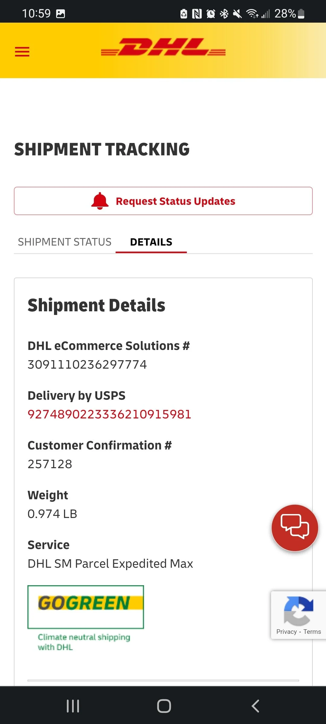
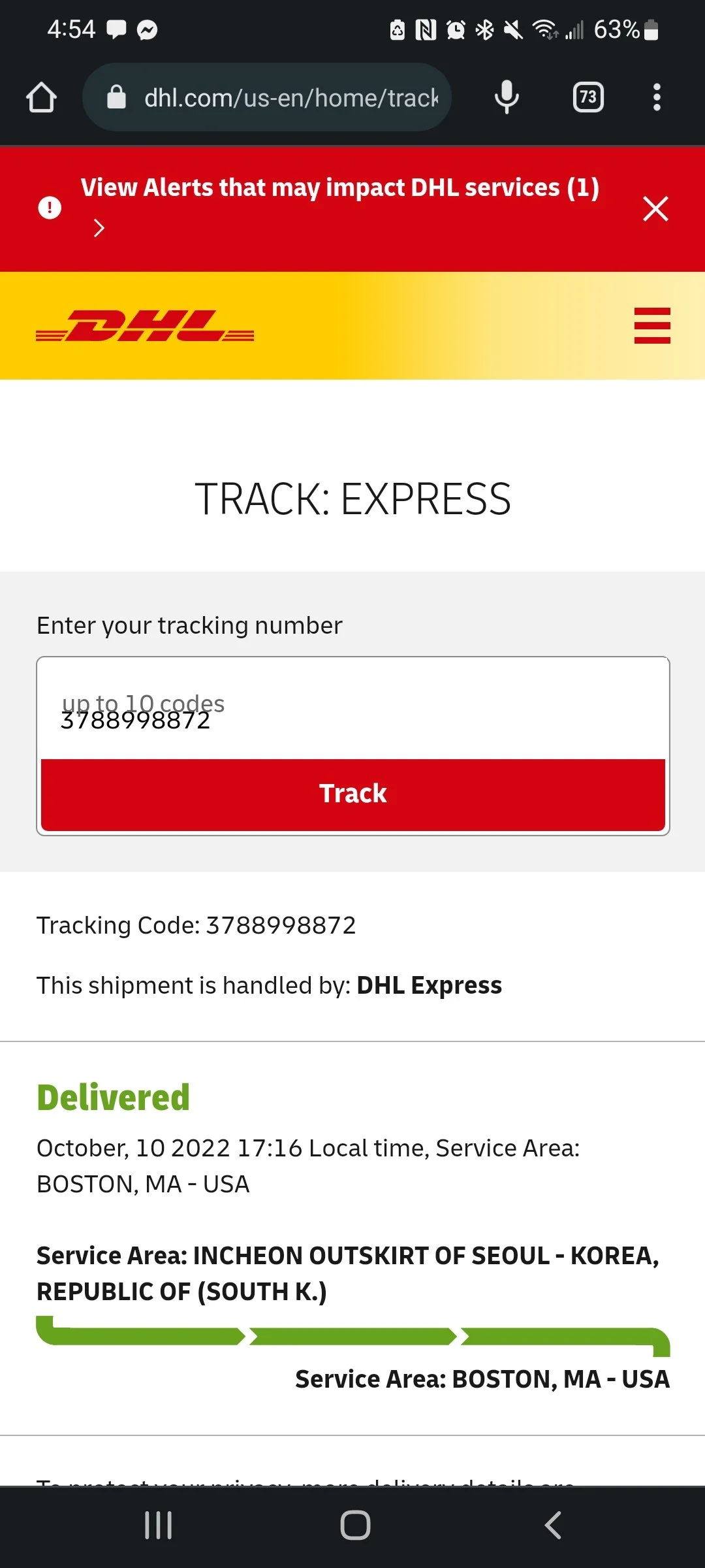
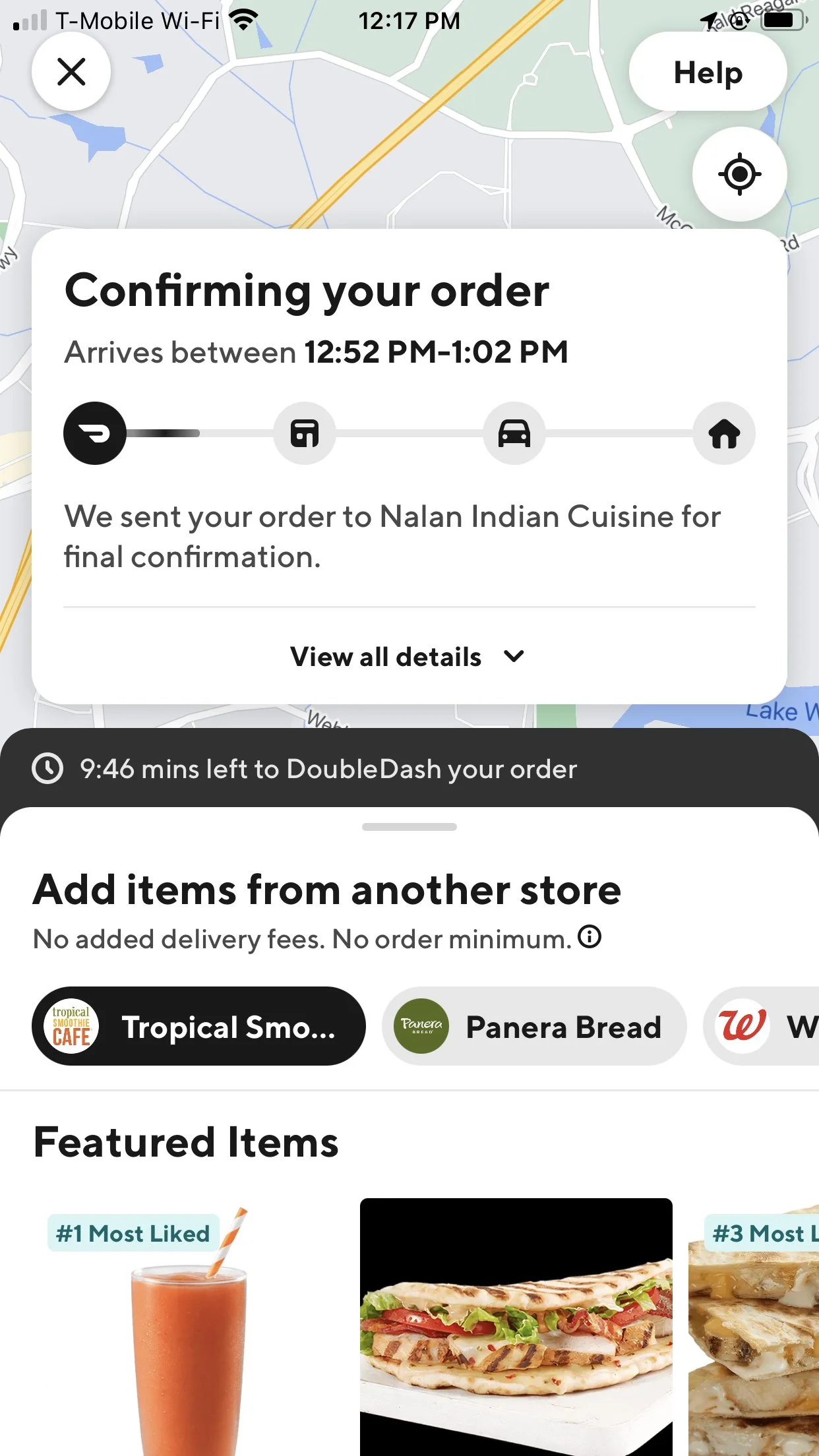
Our comparative analysis on the other hand was more informative. Keeping in mind our users expressed need to know where their baggage was at all times, we immediately thought to look at companies that specialized in “goods delivery services”.
DHL
Provided specific details as to where the package was in the delivery process.
United States Postal Service (USPS)
Clearly noted the estimated time of arrival (ETA) of the package, as well as opt-in for text/email notifications.
UberEats
Maintained a tone that ensured their customer of what step in the delivery process they were on, as well as animations to give the impression that actions were being taken.
Initial Design & Iteration
With Every Project, there are Constraints
With our research in hand, the team went into our ideation phase with a few constraints in mind to play within:
Southwest Branding Guidelines
The company already had pre-existing guidelines to use; we had to consider the hospitable and friendly tone they’re known for while also using color styles familiar to their travelers
Current Web Design
Trying to find the balance between what’s existing and what can be so that we could reimagine a new experience, but also not create a jarring experience for existing users
Baggage Policies
Southwest has baggage policies that can’t be changed. So we had to work with it.
Cost Limitations
We wanted to create a solution that wouldn’t break the bank; while we could imagine high tech features, we wanted to be mindful that
Design Studio
Keeping in mind our constraints, the Team come together (virtually) to envision possible solutions for the problem.
For the session, we had a few scenarios to guide us: “How might we…
… provide more information to users on the go?”
… share information in an easily digestible way?”
… earn back the travelers trust in the cases that the airline mishandles their baggage?”
Our First Pass
Coming out of our design studio, the Team discussed feature prioritization. Which features are going to answer our travelers needs and pain points the best while also staying within business constraints?
Recalling the user’s on-the-go situation, we wanted to make sure we focused on mobile-first design and chose a mid-fi mock up for our initial design. In doing so, we prioritized the following features:
Called out Help with Baggage right on the front page so that travelers don’t have to dig for features
So that users could leave the airport quickly, we included access to a digital form to report delayed baggage (expandable image)
Similar to the comparators we looked at in our research, we wanted to have a tracker to tell users the location of their baggage
A confirmation page at the end of form submission to affirm the action was taken.
Usability Testing
The Team wanted to test the practicality of our prototype with travelers to see it was addressing their problems. We worked with 6 participants to understand the following:
How quickly is the traveler able to find the information for their baggage?
After seeing their baggage, what is the natural next step once they’ve gotten more information?
Direct Successes:
From the menu to inputting their bag tracking number and seeing their baggage status, we saw participants spend an average duration of 8.8 seconds on the task
Indirect Successes:
Here we saw an opportunity to decrease the number of selections the traveler would need to make before they can see their baggage info.
3rd Iteration & Usability Testing
To further vet our designs, we consulted with a UX instructor, we realized that we were missing something big: the traveler still didn’t feel like they were effectively being helped and still didn’t know where their baggage was.
Our answer was to reconsider our UX copywriting. To do this, we time-boxed another mini design studio and brainstorm ways our words could reassure the traveler. To narrow down our options, we decided to speak to someone else we knew had had an experience with lost baggage to look at our copy with fresh eyes and validate our results, and it helped being the final design into light.
Key changes we made include:
Included Radio Buttons to decrease steps and choices
Decreased the amount of information the user needed to fill out and added information about baggage recovery option and compensation to create the “finish line”
Added a more hospitable, friendly message to reassure the traveler
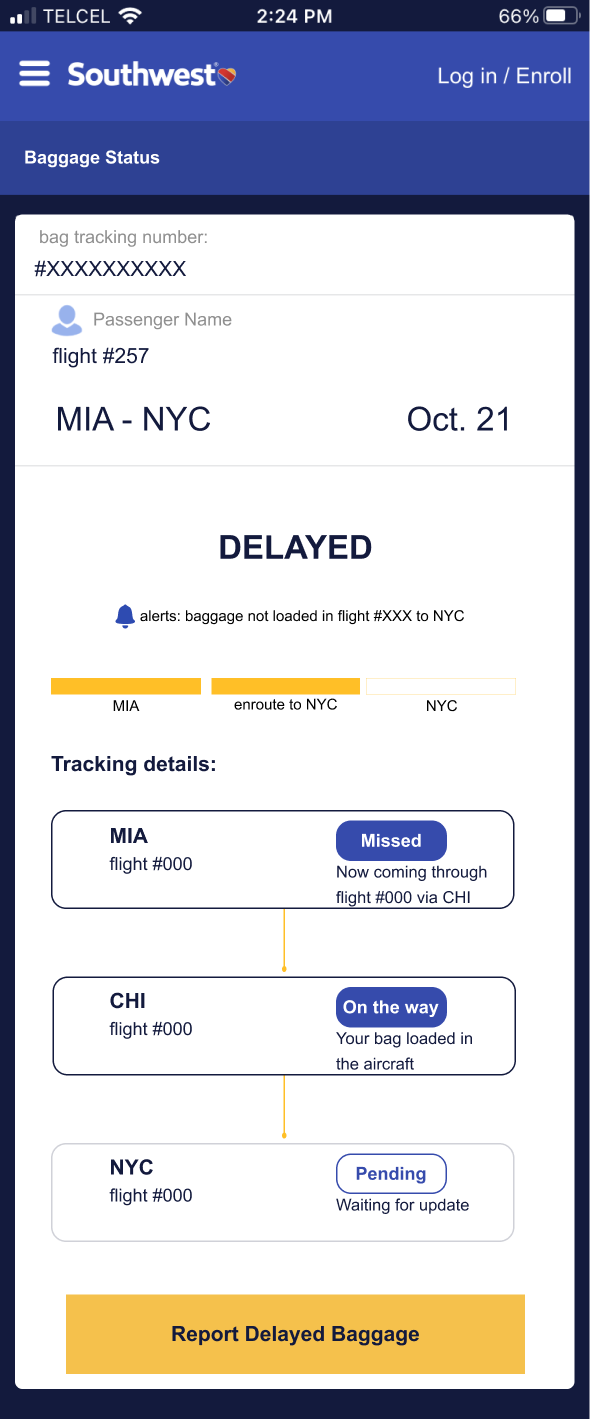
Made a more accessible and detailed tracker
Found another opportunity to reassure the traveler and provide digital hospitality in the confirmation page and subsequent return to baggage status page
(Click on Images to Enlarge)
Final Proposed Solution
Click Images to View Clickable Prototype
Next Steps
While the team was able to accomplish a lot in a short amount of time, the there was still room for improvement and iteration. Thinking about next steps, we would want to conduct a second round of usability testing over the course of two days to focus on the following:
Copywriting: Does our updated copy make the traveler feel more relieved and assured? How would we measure their level of trust?
Responsiveness of the desktop website: Is the traveler able to find information as easily with the change in layout
From there, we would do another round of iteration from our findings.
Reflection
Successes
Areas for Improvement
Collaborated with other creatives for the first time, which lead to an open flow of ideas
Learned how to conduct a fruitful design studio via time-boxing and being open to any ideas brought up
Developed a stronger ability in how to ask different kinds of questions to meet goals
Experienced the struggles of being a PM, mostly the difficulties idea wrangling to stay in scope and keep the group on task
As a designer, learning and working with different design and working styles, thought processes and execution styles in communication and learning
Setting success metrics and sticking to them
